Origin OS offers cleaner notification design for UK phones
British reviewers highlight clearer alert readability in vivo’s new UI
UK reviewers who have tested the latest OriginOS builds say the redesigned notification style feels cleaner, easier to scan, and less visually noisy than older vivo software. They say the panels now show more breathing room around message blocks, which makes alerts more comfortable to read even during fast daily interactions. In shops, bus stops and commuter platforms, British users tend to check alerts quickly without pausing, so a less crowded notification structure supports faster recognition. Observers say this calmer information layout has become one of the most talked-about improvements in the new UI direction because it removes unnecessary distraction from basic alert flow.
British tech analysts also note that the new spacing logic helps notifications carry more “meaning-per-glance.” They say older skins often stacked alert cards so tightly that the eye needed extra time to interpret sender details. In the latest OriginOS, the scene looks more structured: message titles, app names and summary text appear in a cleaner vertical rhythm. UK reviewers say this saves mental effort because users do not need to visually decode multiple design layers. They mention that even small spacing improvements can influence buying impressions in the UK, because first glance readability often determines whether an OS feels premium or not.
UK smartphone testers also highlight animation behaviour during notification pull-down. They describe a smoother and more predictable motion pace that avoids abrupt flicker between partial and full panel states. British users say this matters because a flicker-free notification shade makes the system feel better engineered, especially during one-hand operation while walking or travelling. When the OS does not shake or stutter during pull gestures, users interpret it as evidence of stronger internal tuning. UK analysts therefore say animation discipline is an indirect reason notification clarity feels improved.
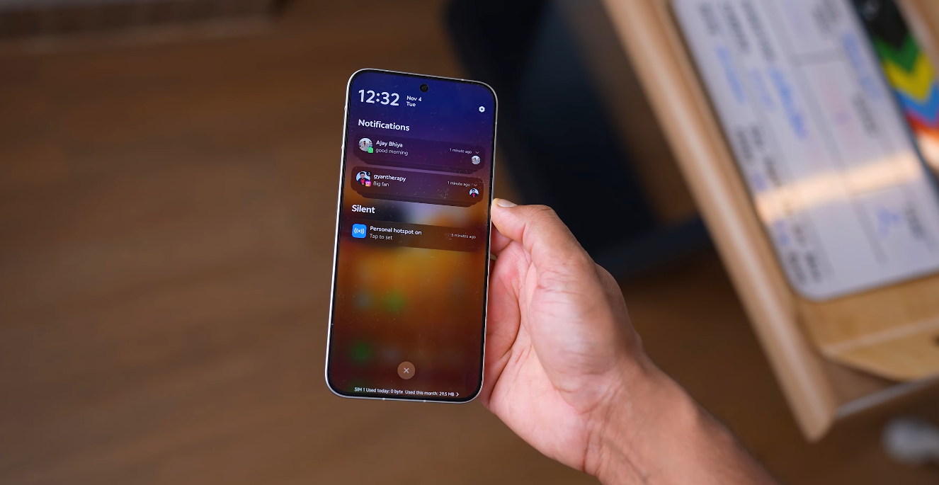
British users also comment that muted colour accents in the panel help prevent visual overload. They say OriginOS now uses more neutral styling around app markers instead of aggressive highlight blocks. The calmer colour palette makes text more readable and reduces the sensation that alerts are fighting for attention. UK commentary consistently emphasises that Western UX preferences reward subtlety, not visual noise. A clean notification colour strategy therefore becomes more than a design choice — it becomes a usability asset.
Another point UK users mention is that notification grouping looks more logical. Instead of scattering multiple alerts from the same app in disorganised patterns, the newer OriginOS structure collects related messages in more controlled stacks. This makes morning catch-up routines easier because users can scan one group at a time instead of chasing individual fragments. For busy British commuters, this reduction in micro-scrolling improves comfort. Reviewers say this is one area where “calm design equals time saved.”
UK tech blogs also say that the new notification surface pairs well with the refined quick-settings view. When users swipe down, they no longer feel like they must separate two noisy surfaces — the alerts and the toggles now share a single calmer visual logic. This consistency reduces cognitive switching overhead. British analysts say most people do not consciously notice this at first, but the reduced friction becomes obvious over days of real usage. And that is exactly how trust forms: when the system quietly helps instead of demanding attention.
Overall, UK reviewers say the cleaner notification design in the latest OriginOS strengthens the impression that vivo is not just redesigning visuals — it is tightening everyday decision paths for Western usage. British observers say this update will matter in retail environments because a well-structured notification shade is one of the first elements consumers test instinctively. If clarity is delivered instantly, trust rises instantly. And UK commentary says this new OriginOS direction successfully delivers that effect.