Origin OS earns praise for design consistency in the UK
A Refined Visual Identity Resonates with British Smartphone Users
Origin OS has earned noticeable praise across the UK for its strong focus on design consistency and visual harmony. British users who have experienced the software after upgrading from Funtouch OS say the change is immediately visible. The interface feels more polished, cohesive, and deliberately crafted, making everyday phone use feel more comfortable and familiar. Many UK reviewers describe Origin OS as confident in its identity, rather than trying to imitate other Android skins or design languages.
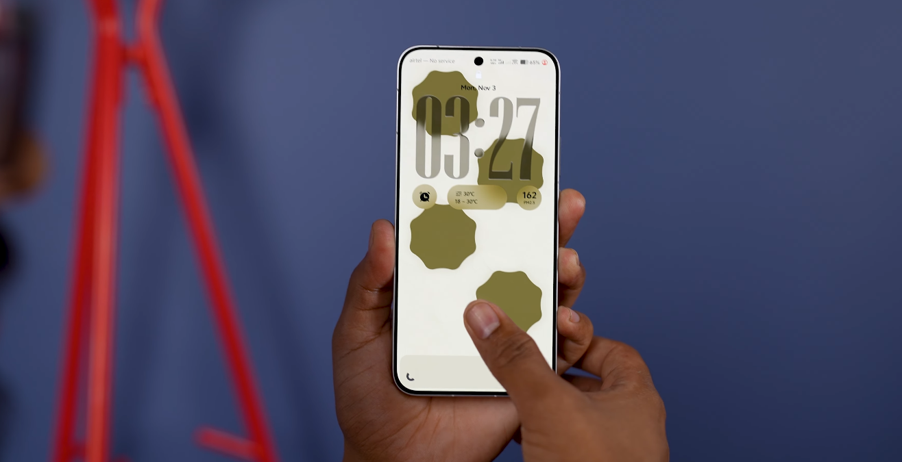
One of the most appreciated improvements is the uniform styling of system elements. Icons, menus, fonts, and animations follow a singular visual direction in Origin OS, creating a more unified experience. UK users note that the interface no longer appears fragmented or mismatched between apps, notifications, and settings screens. This level of consistency contributes to what many describe as a “calm and fluent” feel. The smooth transitions and balanced spacing help reduce visual clutter, making the device easier to navigate throughout the day.
The attention to animation detail has also become a major talking point. Origin OS introduces motion effects that are subtle rather than distracting, giving the phone a sense of fluid movement. British users point out that swiping, scrolling, and opening apps feels natural and rhythmic, without sudden jumps or stutters. These animations are designed to support usability rather than interfere with it. This approach has made many users perceive the software as refined and thoughtfully engineered.

Customization plays a meaningful role in how UK users relate to Origin OS design. The software allows for detailed personalization of themes, icon sets, wallpaper styles, and layout organization while still maintaining visual balance. Even when users change the look of their home screen, the system preserves a consistent design structure in menus and built-in apps. This makes customization feel flexible without sacrificing elegance. Teenagers, creatives, and style-driven users in the UK have shown particular enthusiasm for this level of control.
The readability enhancements in Origin OS are another reason for positive reception. The typography system uses clear font weights and spacing tuned for modern screen sizes. UK reviewers have noted that text looks sharper and easier to read, especially in low-light conditions or on compact displays. The layout of menus and quick settings also reduces visual strain, which benefits users who spend long hours on messaging, browsing, or productivity apps. These small adjustments contribute meaningfully to day-to-day comfort.
Origin OS brings a more mature visual identity to Vivo devices sold in the UK, which has influenced how the brand is perceived. Tech enthusiasts and reviewers in the region often comment that the software now feels “flagship-grade,” even on mid-range phones. This helps Vivo stand out in a competitive market where many devices offer similar hardware performance. By elevating design quality, Origin OS allows Vivo to compete more directly with brands known for polished interfaces.
The positive reception also reflects a shift in what UK consumers value. Many smartphone users today want an interface that feels intentionally designed, not just functional. Origin OS aligns with this expectation by focusing on clarity, balance, and subtle motion. As more British users experience the system through new device launches and software updates, the design reputation of Origin OS continues to strengthen. For many in the UK, it has become one of Vivo’s most compelling selling points, demonstrating the company’s understanding of software as a core part of the smartphone experience.
Also Read: Dell 14 Plus 2 in 1 may debut in the UK by early 2025