Origin OS brings refined design language to UK phones

British tech community evaluates vivo’s new visual identity strategy
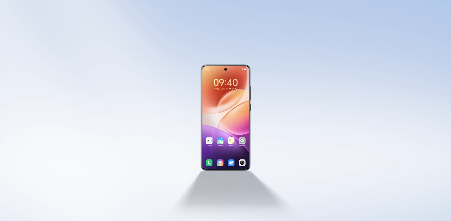
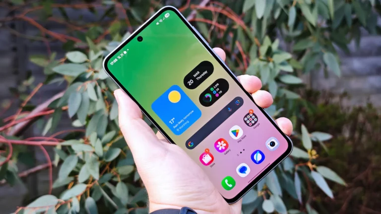
UK analysts say the new OriginOS update looks more intentional in its visual structure than previous versions. They describe cleaner spacing, calmer layout math, and a more balanced screen presence across core system surfaces. For British users, this calmer layout makes interaction feel more predictable and less visually dense during fast app switching. Reviewers say this matters because visual simplicity supports faster recognition and reduces eye strain during repeated daily actions.
British tech writers also say the new design aligns more closely with Western UI expectations. They compare the updated OriginOS direction to Samsung’s One UI and Google’s Pixel interface, where clarity and readability are prioritised instead of complex decoration. This shift signals that vivo understands the importance of Western perception. UK analysts say this alignment could help vivo build stronger identity in European markets where design tone influences trust as much as hardware specifications.
Typography refinement is being highlighted as a noticeable improvement. British reviewers say text hierarchy now feels calmer, with less aggressive font weight distribution in key system screens. Cleaner text blocks make notifications and quick settings easier to parse with less cognitive overhead. UK users often judge UI comfort by how quickly they can interpret labels, and British commentary says this calmer typography supports smoother rhythm during everyday usage sequences.

UI card surfaces also appear more controlled. Analysts in the UK say that earlier skin layers in OriginOS had stronger visual layering, while the new interface feels flatter and more unified. This reduces collisions between motion transitions and shape boundaries. British observers say predictable motion is important because it helps users retain mental context while switching between apps. A stable card system allows the interface to feel premium without flashy visual saturation.
UK analysts say this visual discipline could help vivo differentiate itself more clearly in retail environments. When users test phones in stores, they often judge within seconds whether the software feels stable or inconsistent. If the interface looks intentional and balanced, it can create early trust before deep feature exploration. British coverage suggests that buyers in the UK are more likely to engage with a device longer if the UI feels calm from the first interaction.
However, UK reviewers also note that polished visuals alone will not decide final reception. The updated design must be paired with British firmware builds that meet banking app reliability, continuous NFC consistency, and carrier-level certification stability. Visual refinement can create interest, but operational reliability ultimately shapes public perception. UK experts say these combined layers — design plus consistency — will decide how confidently British consumers adopt vivo software in daily life.
British commentary says that the new design structure appears easier to scale. A calmer base layout can adapt smoothly across multiple screen sizes without creating visual imbalance. In the UK market, where users switch between compact flagships and large-screen models, scalable aesthetics are considered a practical advantage. Reviewers say this makes the new OriginOS direction more compatible with Western buying patterns where display diversity is normal.
Overall, UK analysts describe the refined design language in OriginOS as a strategic identity correction. British reviewers believe vivo is intentionally moving toward Western UI comfort standards rather than chasing dense visual texture. If this design tone is matched by reliable UK-region firmware rollout, British tech communities say the OriginOS evolution could strengthen vivo’s software profile and help the brand compete more confidently in the UK market.


