Origin OS brings new visual identity for UK smartphone fans

British users react to vivo’s latest refined UI direction
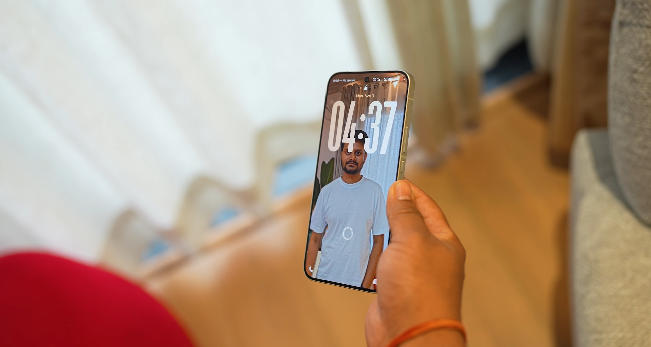
UK smartphone followers who track vivo updates say the newest OriginOS styling now looks more organised, calmer in tone, and more consistent across interface surfaces — and this change is shaping how British users interpret vivo’s maturity as a brand. They say the new visual identity does not rely on aggressive colour density or overloaded surface graphics. Instead, it focuses on clearer alignment rules, simpler structure and cleaner screen balance. For UK Android observers, this calmer visual baseline makes the OS feel more premium from the first few taps, which matters because British buyers evaluate UI comfort very early during device testing in stores.
British reviewers also say the updated design tone makes the OS easier to live with during daily usage. They point out that reduced visual complexity helps users understand where controls are, without needing to study the interface repeatedly. They say that this reduction in visual pressure is important because UK consumers often multitask in fast switching scenarios such as travel, transit, or work-break browsing. If the screen looks calmer, the mind interprets controls faster. UK analysts say that this is one of the key reasons the new visual identity feels like an upgrade rather than a skin refresh.
Another recurring point in UK feedback is the emphasis on more predictable motion consistency. British reviewers have been paying attention to animation pacing because transitions often influence perceived software stability more than benchmark charts. They now describe the new animation behaviour in OriginOS as more balanced, with fewer abrupt shifts and less motion conflict between UI cards. This matters because British users judge “smoothness” as a sign of quality. When motion behaviour feels controlled, they interpret the software as better engineered. UK coverage says this is a major step toward Western-style UX discipline.

Typography refinement is also being highlighted by UK observers. They say that the new font weight distribution, calmer headings, and more structured spacing between sections make the interface easier to scan. British tech writers often say that UI clarity is measured by how quickly text blocks can be absorbed at a glance. With the updated visual identity, they describe menu labels as easier to parse, which improves comfort during everyday usage tasks like checking notifications, reading quick settings descriptions, and browsing inside core system screens. They say this clarity helps build trust because it lowers reading friction.
UK experts also say that the calmer visual identity supports better user confidence during permission handling. Privacy dashboards and sensitive controls are easier to interpret when the interface does not overload the user with visual noise. British users care about this because privacy signals in the UK are considered serious behavioural anchors rather than design details. When UI clarity rises, the user experience around permission logic becomes easier to trust. They say this new visual identity therefore reinforces privacy usability indirectly, even before any deeper features are evaluated.
British commentary continues to mention that the benefits of refined design must show consistency inside real UK firmware builds. They say the new visual identity looks promising in demonstrations, but final judgment still depends on UK rollout behaviour. British network validation, UK banking app stability, NFC payment behaviour, and Play integrity compliance are the final checkpoints that decide adoption confidence. They say that visual maturity is a positive signal — but users in Britain still want confirmation that stable performance follows the same refined philosophy.
Even with this cautious view, UK tech communities say the shift in OriginOS visual identity already changes how vivo is perceived in Western discussion. They say OriginOS now looks like something designed to stand alongside established Western UI philosophies — not a regional skin built only for one country. For UK smartphone fans, this matters because it positions vivo as a brand that understands international comfort standards, and not only domestic visual preferences. They say this new identity gives vivo a stronger chance to compete for attention in UK stores, especially when buyers judge phones quickly based on feel rather than raw specification tables.
Overall, British feedback frames the new OriginOS visual identity as calmer, clearer, more structured, and more aligned with Western UX expectations. UK observers say the software now feels more intentional — and this alone increases perception of brand maturity. They describe the update as a meaningful shift that could support stronger British reception if the UK firmware rollout maintains stability across sensitive real-world usage.
Also Read: iQOO 15 may arrive in the UK sooner than expected


